PROUDSUGAR
A data-driven agency that helps increase the revenues with CRO.

visual design / ux / visual identity


THE CHALLENGE
As a co-founder of Proudsugar, along with Javier Rincon, we established some core concepts in our culture book, the main core value being "Of the Highest Quality".
"Of the Highest Quality" can be understood as an element with different planes and faces, like a polyhedron, where the planes are concepts like appealing, message, concept, understanding, ease of implementation, etc. and which every plane has to reach enough quality by itself because if not the general outcome it’s not achieved because only with all of them the " Of the Highest Quality " concept is achievable.
Our clients had to be able to perceive and understand in first instance our chase in each and every single plane of our "Of the Highest Quality" concept
THE WORK
As a co-founder and designer, and in addition to the work done for our clients, my work for our agency was all the visual identity and visual design, as well the development of the website (wordpress), ux/ui, and of course, all the work that you have to do as a co-founder!! :)
THE PROCESS & OUTCOME
Logo: the inception
I subscribe the idea that the communication of any logotype, isotype, or imagetype (communally understood all under logo) should be associated with a specific idea or concept representative of the brand, whether it may be more or less abstract. The Designer has also the possibility to go deeper and may show not only one but more levels of deeply embedded communication.
When the logo is able to go beyond and transmit not only a description of the name or work, but even the company’s concept, the soul or the meaning, and do it with appeall, elegance, coherence and significance, then the brand memorability imprints at a higher level in the mind of the viewer, working almost as an active publicity agent.
With these precepts in mind I moved to create Proudsugar's logo. But this presented some added difficulties: our name was totally non associated with our business, and even more, the concept itself of sugar and proud was difficult to represent visually in a proper and contextualized way
Logo: concept & style
To solve that, I started a process in which I tried to transmit both concepts: low level (i.e. name) and high level (growth, improvement)
In the process I figured out that the potential association between the concept proud and the parallelism that could be established between it and concepts like improvement, growth, etc., could be interesting.
After different ideas, the solution came to show two cubes of sugar, but the second bigger than the first, alluding to growth.
Related to the style, it had to be elegant and appealing, clear and simple but resounding and rotund. Also, it had to respond properly to a need for ease of implementation and easy recognition on a small scale.
So, the outcome is a logo that represents the values of the brand, very usable in any circumstances, flexible, attractive and contemporary, representative, memorable and with a clear significance on the purpose and the soul of the company.

Cards
The idea behind the cards was create something innovative, to stand out of the rest, and create a positive reaction when somebody receives one of them, but of course being as functional as possible. Also to take advantage of the concept that shows the logo, reinforcing the brand image while being fully transversal across mediums.
So the idea was impress and impact at first sight in order to keep the viewer’s attention; in a second step, to send a message to showcase the purpose of the brand, and eventually to work as a regular contact card, containing all the useful information.

Audits and other material
Naturally, these precepts were adapted to other areas like all the brand and image material, presentations, audits, business material, administrative stuff, etc. The objective was to create elements as useful as beautiful, with great power of communication.

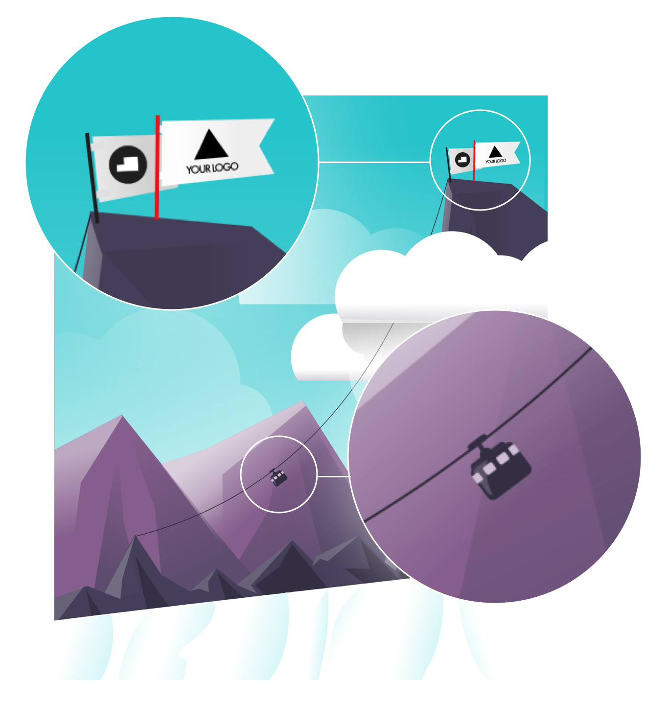
As an example, here we have the audits template. The cover illustration for the audits shows an image that tries to represent the work of Proudsugar with the clients. Two flags in the summit of the mountain, with the Proudsugar logo and the client logo (the logo is changing depending the client) showing where we want to arrive together. A cableway, showing the way. Inside the document, and special attention to the usability was taken into account (typos hierarchies, visual elements, arrangement, etc)

Example of different pages in a real audit made for a client
Websites
In all of our different websites, the intended principles were great communication and powerfully visual elements. A clear and powerful copywriting, combined with appealing visuals and a proper UX structure that indicated a clear and perfect mixed capability to achieve the client’s objectives, being the outcome powerful websites, regardless of style or fashion.

Main page

Detail: mobile behavior
Detail: Main page illustrations
Detail: "New products" illustrations (Click to enlarge)
Main page

Detail: "Our services" illustrations
Main page: header (Click to enlarge)
"Growth Program" page
"About us" page (Click to enlarge)
Web illustrations (Click image to enlarge)
Landing page
Along with the website, we created a landing page in order to offer a free website review; in this case, along the great communication and powerful visuals, we included humour as an added element; this works perfectly well as a tool when it is done in the right way and with proper adjustment to the purpose.
The landing page is like a typical 50's advert, keeping all the classical elements expected to see in these kind of adverts. But always keeping in mind that the purpose is to have a functional page, and for this reason all the elements have a purpose, although some can be more emphatic than others.
The differentiation of this style (not usual to see nowadays) works as a hook in order to keep the viewer interested and intrigued, but the selection of this style is not only because it’s unusual these days: the base of this 50's style (the font's weight and typos, the visual cues, the speech, the mood, the illustrations...) work perfectly with the UX and the flow and the outcome is a page than is not only pleasant to see but works properly as a landing page. The result being very effective.

Illustrations and visual elements
In the page "Illustrations", along with other works, you can see more of work done for Proudsugar, like our mascot "Proudly". Feel free to visit it!
