
FEEDER
Cutting-edge technology to analyze user behavior.

Visual Identity / UX / UI / Visual Design


VISUAL IDENTITY
Logo
For the visual identity of Feeder, a cutting-edge technology to analyze user behavior by measuring their reactions and emotions through facial recognition technology, I initially proposed several conceptual lines, each one different but with the intention in all of them to signify the basis of the platform (thus becoming requirements).
On one hand, the reaction of a user to an audiovisual content that is sent to him; on the other, to show the facial recognition of emotions, which is the basis for the analysis of this reaction.
In addition, the fact that it could transmit positive connotations of affability, trust, etc. was especially interesting, given that facial and emotional recognition is a relative new topic and has some complex aspects that generate some controversy.

With this in mind, the next step was to see how the above requirements could be brought together in a single visual concept. In relation to the "flow" (the way the platform itself works, the process) the user receives an audiovisual content and sends his reaction to that content back, and this is produced by facial recognition of the user's emotions.
To show the facial recognition on which Feeder is based, the most obvious solution was the use of a face, but in this case, almost at a symbolic level, and at the same time reflecting positive aspects (the most obvious option would be laughing or smiling).
After numerous iterations, I decided to use the process itself as the basis of the structure. Thus, the users (represented as circles) would take the role of the eyes in the hypothetical face and the reaction line, making it curved, could resemble a smile.
Thus, the operation of Feeder was implicit in the figure, we had the representation of the face at a basic level and, in addition, with the connotations of positivity.

Next, I chose to rotate the logo 45º, with the idea that the straightest and most direct arrow (the one that implies sending the content to the user) would also be in accordance with physics itself, because it follows the logic of gravity, since it would be "falling", but maintaining the understanding that it was reflecting a face.
Once this was defined, the next phase in the design would be to create the actual "frame" of the figure, which would encompass the structure and "flow" mentioned above, and which would be visually attractive and communicative.

Once this base was formed, the work focused, on the one hand, on the visual aspects: proportions, ratios, sizes, shadows, etc. On the other hand, the typographies and vertical and horizontal structures and, finally, to generate all the visual language, which was aligned with what we wanted to convey with the logo: vibrant colors, dynamic shapes, strength, confidence...
Thus, the result obtained is both a logotype and a visual identity that transmits all the values, ideas and concepts required, easily reproducible in different areas and with a visual language that reinforces the message to be projected.

In addition, it should be noted that since the "flow" itself is implicitly integrated into the logo, it allows us to create animations of this type, which show the basis of the platform's operation.
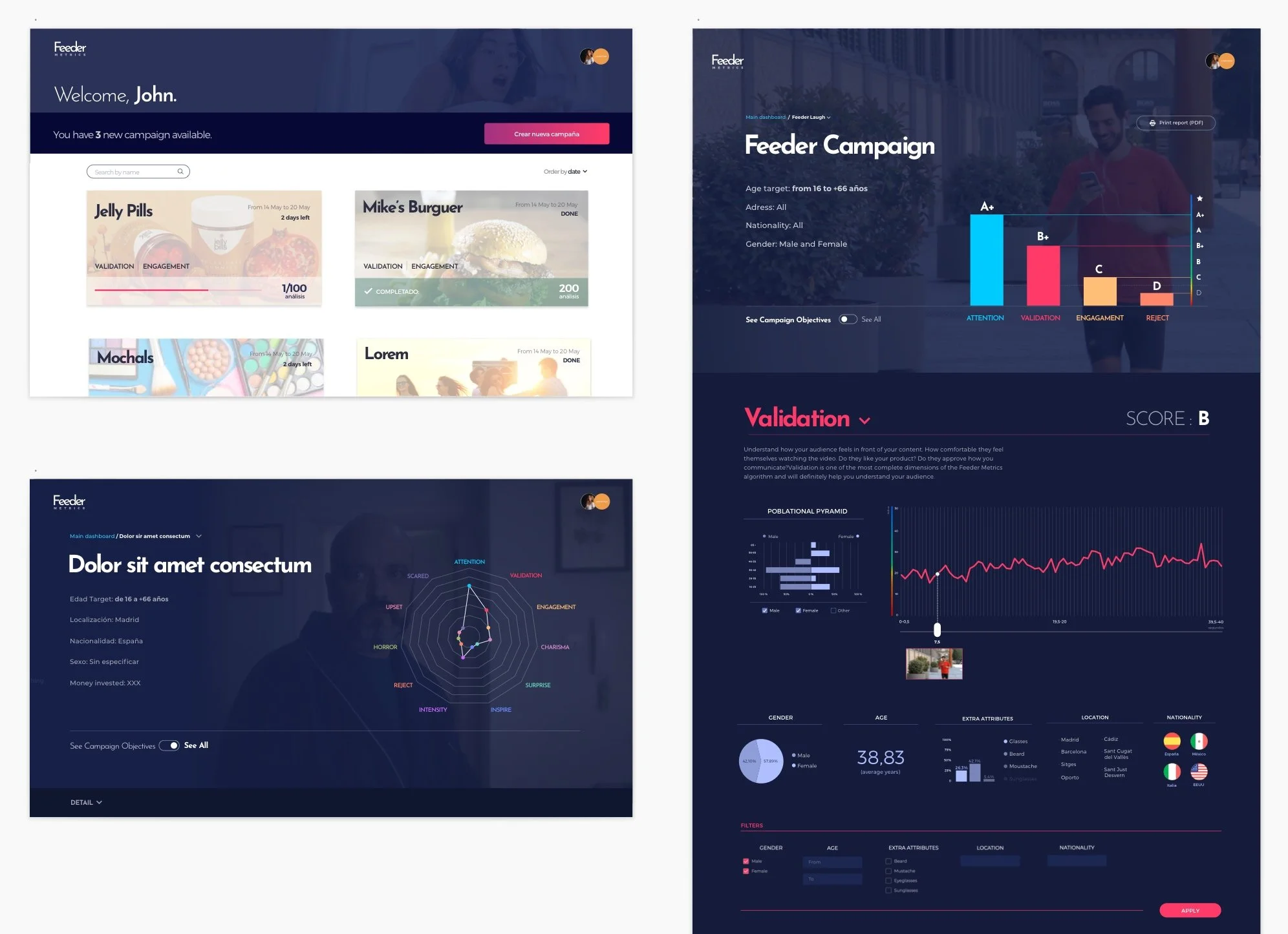
FEEDER METRICS: DASHBOARD
Conceptualization and design from scratch.

FEEDER: APP
Conceptualization and design from scratch


WEBSITE
In relation to the website, the idea was logically to maintain the transversality in relation to the identity and visual design already created.
In terms of message and content, the focus would be on Feeder Metrics, the emotional analysis management and visualization platform/dashboard provided by Feeder.
Regarding the upper part of the website, the "header", I divided it into two levels, showing the upper one and leaving the second one hidden in the first instance: this way, as soon as the user arrives to the website, he would see the image of a girl who, surprised, looks at a content on her phone and then the Feeder's slogan ("Dont' act, React") appears.
When the user scrolls down, we link the emotion shown by the girl but not to the content she is viewing, but to what Feeder is. To do this we introduce a "parallax" effect and through the visual language of Feeder, we show a landscape that, on the one hand, has a futuristic feel, to represent that Feeder is "the future of facial recognition in marketing" and, on the other, has a horizon in which the view is lost, representing the huge new field of possibilities offered (with the wink that the mountains are created using the tool's own graphics).
Throughout the entire website, the idea was to use the resources of animations, "parallax", and graphic elements in concrete and specific points, always with the intention of emphasizing the message conveyed linked to each section, and to increase the communicative force. On other hand, the parts related to the texts would be extremely clear, minimalist and with large negative space, to facilitate their reading as the main objective and, as a secondary objective, to work as a counterweight and balance to the vibrant colors and energetic shapes of Feeder visual identity.
