OTHER PROJECTS

COLEGIO OFICIAL TRABAJO SOCIAL de LA RIOJA
Work done: Logo creation
The Official Social Work College from La Rioja (Spain) was looking for a new logo that fits its needs of a more contemporary and communicative logo.
The aim of the new logo is to achieve two objectives; on the one hand, it seeks to modernize the image of the school, bringing it closer to present times, and on the other hand it is intended to explicitly and obviously represent the values f social work.
To do this, I started from the scratch at the conceptual level and the basic elements in the logo were rethought: form, colors and shadows.
Fundamentally the isotype is composed of two identical figures; the idea behind that is to humanize the concept and make an approach of the positions related to social work and of the citizens who use it.
The figure closest to the viewer represents the Social Work, its workers. In addition, it includes the colors of the flag of La Rioja. In front of this figure we have what could be the shadow of the first, but by deliberately moving it away from one another it appears as a new figure by itself; it represents the people that social work helps. The figures have a position of approach, of embracing each other, and it is this action that determines the meaning of the logo: moving away from other concepts such as charity or beneficence, the attitudes of the figures transmit more the delivery of help in a friendly manner, like an equals. In this way, it helps to configure the idea to perceive the College as a friend more than a "cold" institution.
Related to stylistic aspects, the color base of black and grey was selected for purposes of saving and ease of use in black and white, losing in this last case only the representative colors of the flag of La Rioja (which are in color).

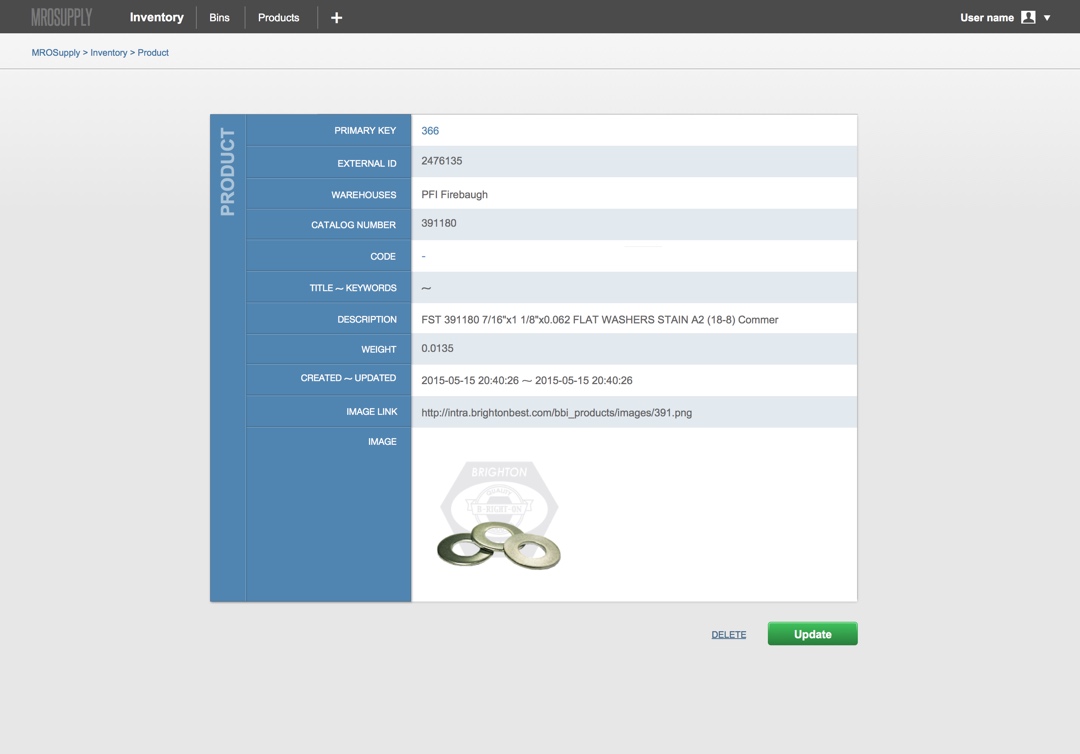
MRO SUPPLY
Work done: checkout / shopping cart / registration / product page
MROsupply.com is the e-commerce extension of Mechanical Drives and Belting, established in 1898 in Los Angeles (yes, 1898, not 1998). They have over 700k parts available and clients like Coca-Cola, Whole Foods and Space X.
The work was the redesign of (among other elements): the shopping cart, the product page, the checkout or the registration process. The effort was focused on the improvement of the UX, the trust generation and the ease of purchase from the user, more than changes in the the visual design.
Below are the old versions and the new versions.

Old version: Shopping cart

New version: Shopping cart

Old version: Product page

New version: Product page

Old version: Checkout

New version: Checkout
As well, the design of a new platform for MRO Supply, an inventory management system, was created from scratch.
(Click on the images to enlarge)


PRAXIS
Work done: Visual identity
Praxis is as a multidisciplinary social cabinet, from the perspective of social work and clinical psychology, and has extensive experience in the management of social resources, people and institutions.
They need a visual identity, including among other elements, the logo, the stationery or the brochures.


MARSJOBS
Work done: logo creation
Marsjobs, a startup based in Berlin with a vision to impact the jobs ecosystem, needed a logo and corporate branding to visually represent them as high quality and professional.
The first step was to really understand the company's vision. Once done, the first challenge was clear: how to visually relate Mars and Jobs within one element. The result must be attractive, simple and memorable. Not an easy task, but after careful deliberation the direction became clear to us. The solution, to integrate a representation of Mars and Earth into one message.
Earth = People
Because it's a concept that's close, familiar and simple to identify with for the vast majority of users. It's simpler to make a connection at an individual level when the core link is universal.
Mars = Companies
The company's naming already includes Mars, so we created a strong visual association between these two elements. Also felt that job hunting is normally associated with feelings of excitement, adventure and novelty. Very similar to how man feels when thinking about Mars.
The intersection of both concepts represents both sides of the equation: people that look for jobs and companies that are offering them. Thus giving rightful meaning to the concept of Marsjobs.

PELICAN BAZAAR
Work done: website (mainpage)
Pelican Bazaar, a brazilian e-commerce focused on premium products. The goal was try to create a perfect blend between visual communication, product marketing and technology. The outcome: a page that presents a solid and coherent brand that communicate trust and quality.

DR. DOBIAS
Work done: Shopping cart
Peter Dobias is a holistic veterinarian with more than 20 years experience. His online business focuses on providing content around prevention and diagnosis for animal diseases, especially dogs.
The goal was to increase conversions along the sales funnel. Especially click-through rates from the shopping cart to the checkout page.
The work done, as a Proudsugar, in UX and visual design increased conversions from the shopping cart to the checkout page by 30%.

Old version (checkout)

New version (checkout): work on UX & visual design
SITEDOVE
Work done: website
SiteDove is the complete website health monitoring solution, which prevents, diagnoses, and repairs your website from critical health risks that are deadly to your site, your income and your reputation.
Sitedove needed to gain more trust, to be in line with the service they sell. When it comes to security, users need to understand exactly what are the dangers and how the client solves them in a solid way. The client needed a clear focus on clarity, and trustworthiness.
So, a solid one-page sales point was created, where the order of items and content information is directed towards the user to eliminate barriers and doubts when it comes to assigning value to the product.
(Click on image to enlarge)


GOPRINT
Work done: website (mainpage)
Go Print is the leading business card provider in South Africa.
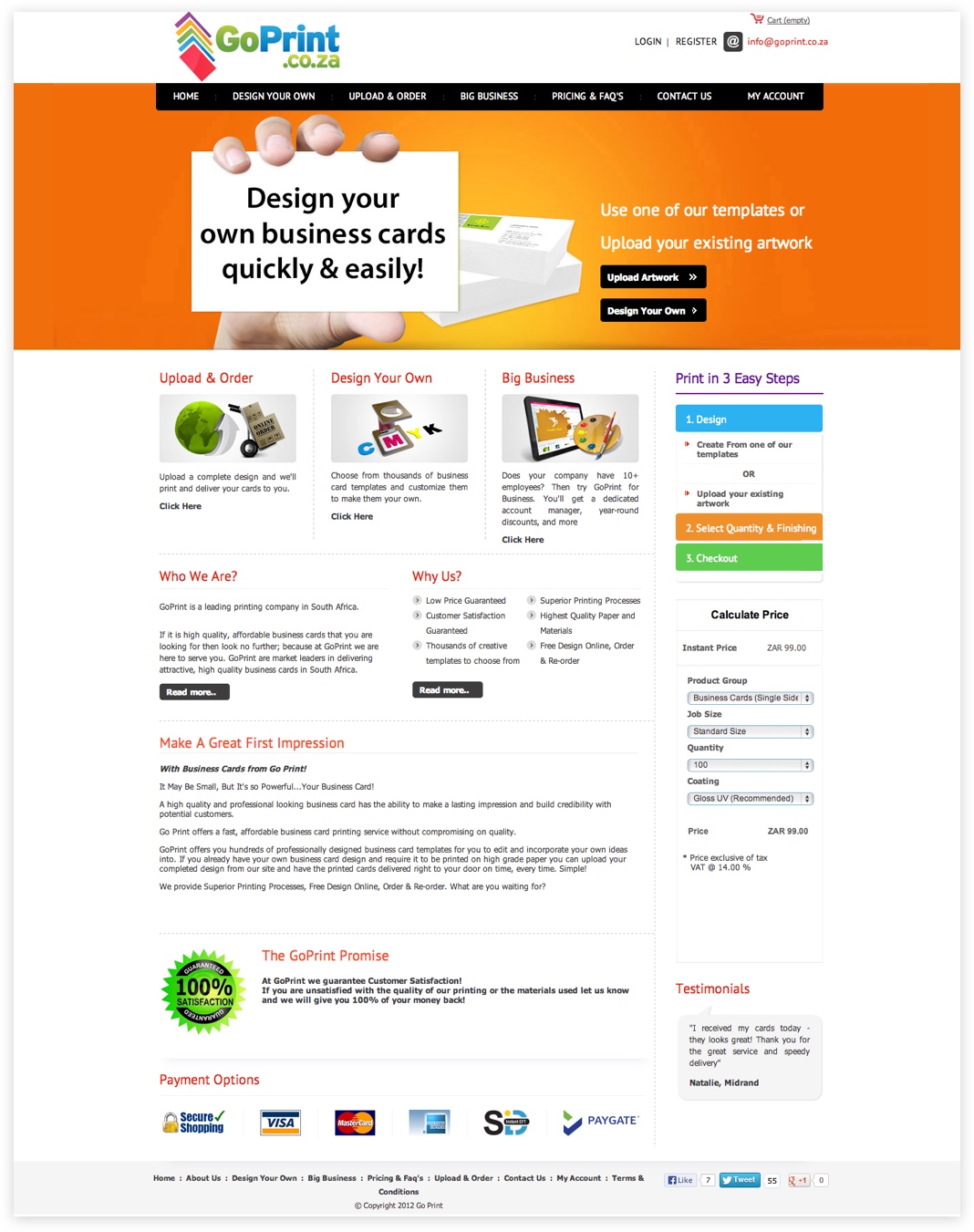
Old version: website

New version: website

Detail 1: illustration
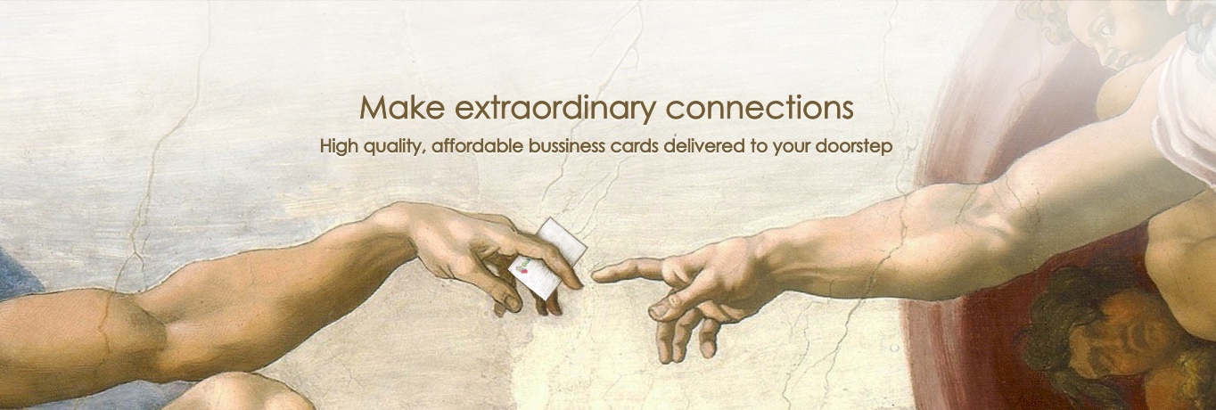
Detail 2: Cover image
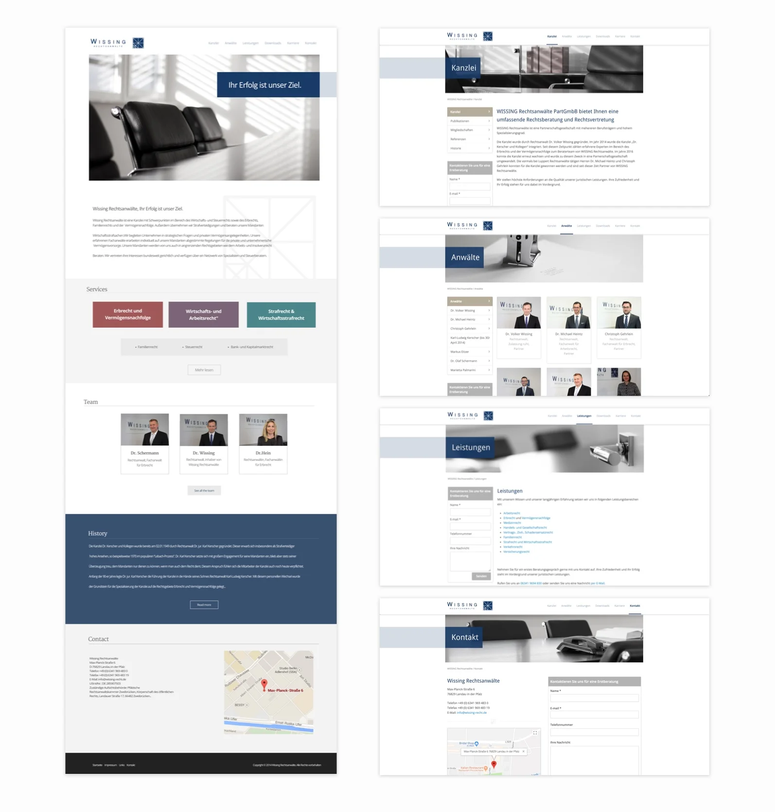
WISSING RECHTSANWÄLTE
Work done: Website
Wissing Rechtsanwälte helps medium-sized companies in all strategic legal matters.
They need a website that fits its requirements of formality, trustworthiness, clarity and quality, as a precepts, towards its users.