
PLUG.DJ
An online social music streaming website with +3 milion users.

visual design / ux


THE CHALLENGE
Plug.dj, an interactive music streaming platform, had the objective to go one step beyond in its position and improve facing its users. To achieve that, it was necessary create a more ease-to-use, more complete, more appealing platform but keeping the soul and spirit of the Plug.dj, both in the way of using the platform and the current visual design.
THE WORK
My work with Plug.dj was mainly in two areas: first, the analysis of the old UX & UI and the creation of the new UX & UI and, second, the optimization and the creation of the new visual elements.
Other work done was from the analysis and creation of the old and new customer journeys, to the prototyping of the new UX and designs, the competitors and customers analysis, or the creation of the use cases.
THE OUTCOME
The work done with Plug.dj had main objectives: give to the user a less cluttered platform and environment, redesign the UX and the flows to give user more ease when navigate and use the platform, and give to the platform a more appealing, sophystcated and better feeling quality look, but keeping the soul and the essence of the current Plug.dj, as in our surveys it reflected by the users.
The previous work comprises the Company Analysis (including among others the definition of the objectives, or the customer journey), the Opportunity Mapping (with the metric status, the UX analysis, or the user voice) and the New Strategy (i.e. the value proposition or the opportunities priorization). After that the new flows, news storyboard, new ux and the new designs were ready to the development, and eventually Plug.dj is rebuilt focused in the main objectives previously commented.
Going into detail and specifying, we can make a quick tour of the platform and comment on the most significant details:
Related to the "core" page in the platform, the “room” page, almost all the elements were restated in terms of usability and also in visual design. Keeping the same the video screen and the avatars, a left menu with shorcuts were added, as well the bottom bar were redesigned, adding a more conventional music platform UX, and changing specific flows (i.e "user as DJ"). The right sidebar now is only for the chat. With all of this, along the more evident visual changes (new icons, typography weight and type, spaces, etc.) along the more secondary (chat sidebar has now also the room background, but blurred, in order of homogeneity) makes the platform gain in terms of ease of use, clarity, perceived quality and appealingness.

New version: the redesign of Plug.dj, keeping the soul but making deep changes in usability and feeling.
Old version (click to enlarge)

Areas redesigned: Almost all the interface were redesigned, in both visual and in usability terms.
With all of this, the elements are more focused and grouped by nature. All of this, along the more evident visual changes (new icons, typography weight and type, spaces, etc) along the more secondary (chat sidebar has now also the room background, but blurred, in order of homogeneity) makes the platform more easy to use, more clear and more appealing.
Old and New (1): In this example we can see how on the old version (up) two differents bar contains differents elements, with elements not related between. New redesign (down) allows to have elements by nature and also in one unique bar.
Some new color behavior was introduced, on order to make an experience more transversal and created a nested elements by nature. Thus, the elements related to DJ experience (buttons to start to play as DJ, the playlist selected, the record icon to communicate the an active playlist, the estimated time, etc) now are in a exciting pink color, making more easy for user to identificate the areas and elements related between.
In the same way, given the amount of elements shown in the screen, the rest of the colors were redefined, cleaning any color not necessary for hierarchy or functionality. The outcome was a very more clear and understandable and easy platform.
As well, some improvement were made like the Estimated Time when DJ enter in the cue, or the visual representation of the DJ's ahead.

OId and New (2): In the old version (up and left) when user is waiting no information about appears. In the new (left down) when user is in the waitlist, now is showing position, the remaining time and the users before in cue. In the other hand, more compacted playlist element in the new version (down right); also when playlist is activated the record icon turns in color.
Another topics: the fullscreen view, now more adapted to this kind of functionality, or the navigation via left menu allows user to have a quickly and easy way to make the desired action, because this menu works not as a web map but a real and useful navigation tool.

New version: Full view

New version: Left sidebar menu open
The "Room info", the page where user can find the info related the community, was totally redesigned. The focus was create a very visual place where, where user find the description of the room, the rules, share activities and also the best of the week related dj's and songs, as well related rooms.
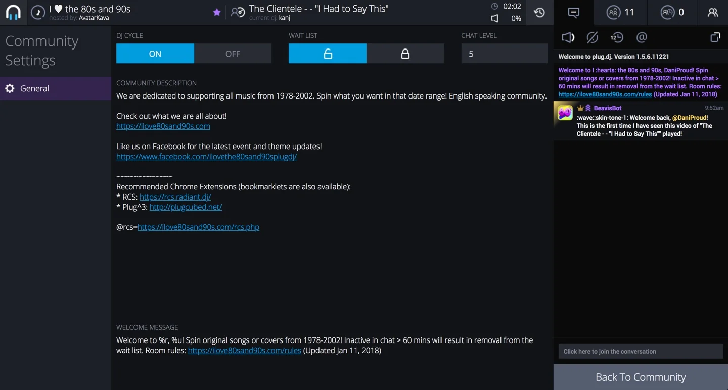
Old version: Room info
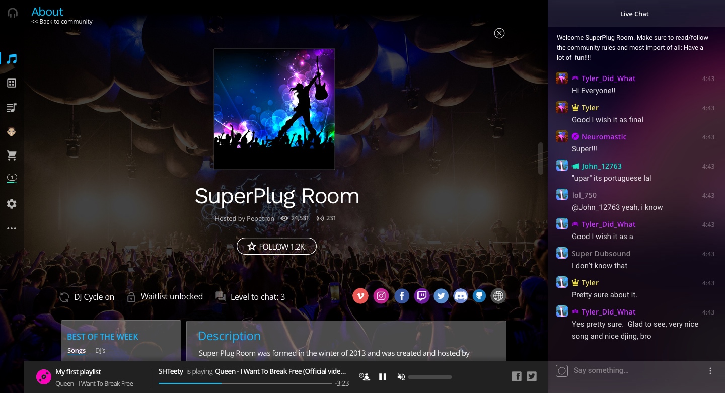
New version: Room info
Finding a community was a little bit uncomfortable before due, among other things, to the the lack of information about rooms. This particular topic was fixed with the behavior of the hover. In the new version, when user hover over a community in the "Communities" page, a description of the room, tags with music genres and the host is given to the user, making more easy understand if this room fits to his preferences.

Old version: Search community

New version: Search community
Another topic worked on was the user onboarding. Due the big importance to understand the platform for newbies, a redesigned process was done, making sure that user is able to understand what is Plug.dj and what he can do on in the very first moment, and then adopting a kind of "doing-focused" onboarding style, accompany the user through the very basic actions, with the proper explanations about it.

Old version: user arriving to the platform for 1st time
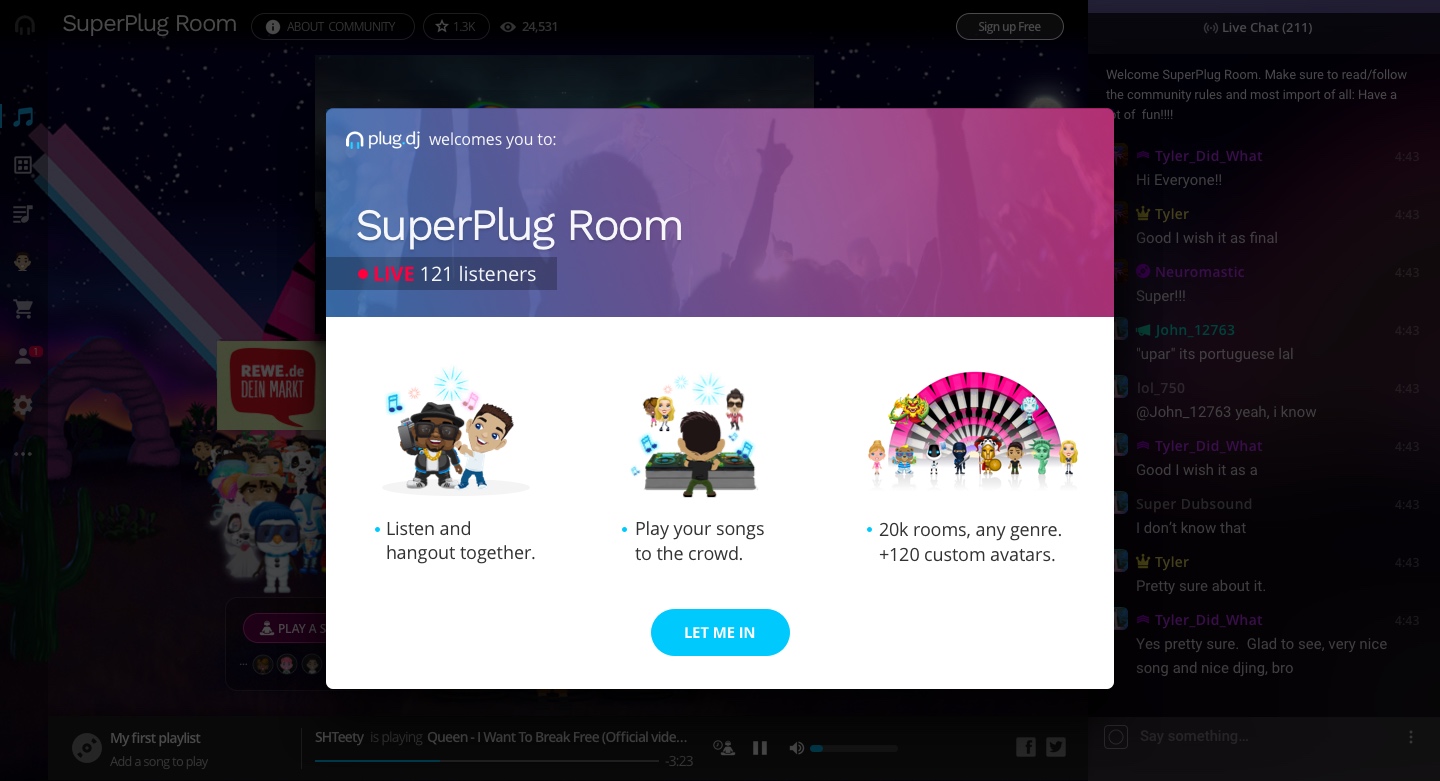
New version: A welcome popup appears, creatring context about what is plug.dj. When user clicks on "Let me in"...
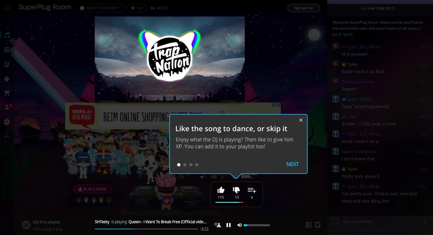
...a clear and specific onboarding popup appears.
Websites
The idea to redo the old website was a possibility in the project. Although finally this redesign was not undertaken, an initial design was done as we can see next.
At the very first moment, the idea was capture the user that arrives to the website for first time and generate the enough expectation to want to know more about the platform. After that, deliver a very clear understanding about what is Plug.dj (an "interactive online social music streaming platform") not just with words, but showing the platform itself. In the original website, the understanding and the benefits were a little bit confusing, and the visual focus were too much into the avatars but without the proper explanation, making difficult a quickly understanding.
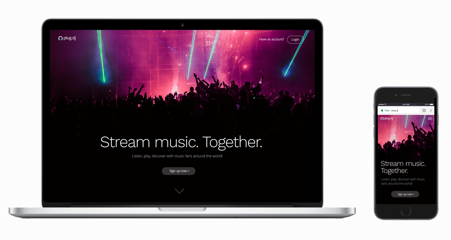
Idea for the new Plug.dj website
The idea about the style was to make it more elegant and sophisticated, like the new style developed on the new platform. Of course, the mobile versions and the responsiveness were taken in account.

