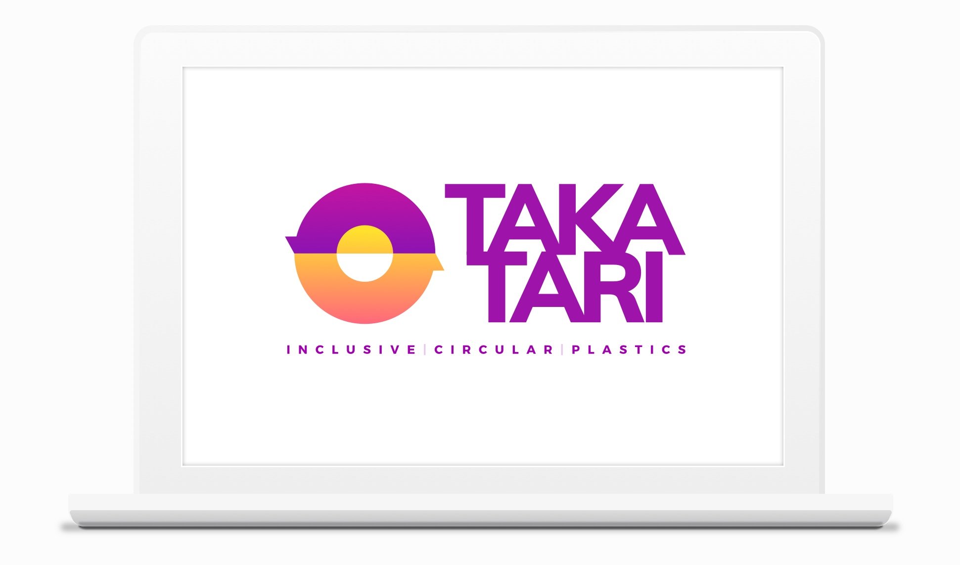
TAKATARI
Circular economy applied to waste management with social inclusion.

Visual identity

My role in the project
Visual identity design. Conceptualization and development of the graphic system, from the definition of the visual concept to the final execution.
Takatari is a platform focused on the circular economy of plastics from a social inclusion perspective, conceived through a social, digital, and circular logic. The project originates from the need to support the transition toward a real circular economy, enabling better recycling practices and articulating a model in which environmental impact, social inclusion, and economic viability coexist in balance.
The project’s name establishes this conceptual framework from the outset. Takatari comes from Swahili, where taka means waste and athari means impact. The combination of both terms synthesizes the project’s ambition: to transform waste into positive impact, both environmentally and socially.
The objective was not merely to communicate sustainability, but to build a system capable of mitigating climate change by promoting a circular economy while actively supporting social inclusion. From the beginning, the focus is placed on the balance between planet, people, and profit, not as a message, but as the structural foundation of the system itself.
The main challenge consisted of translating this model visually without introducing artificial hierarchies. People and profit needed to carry the same weight, while the planet had to function as the common framework of the system.
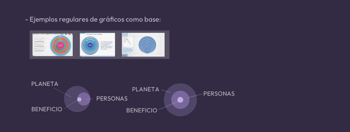
The process begins with the analysis of regular diagrams and circular structures as a formal base. These schemes allow for working with balanced systems in which elements relate to one another without a dominant visual hierarchy.
In these early explorations, the focus is on how to integrate the concepts of planet, people, and profit within a single structure, using circular relationships and continuous flows to avoid linear readings or closed-ended interpretations.
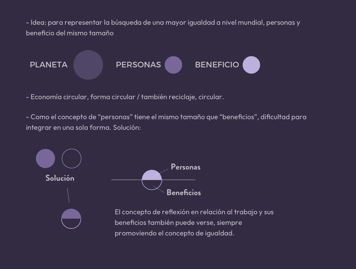
One of the central problems emerges when representing people and profit with the same conceptual weight. Because they share equal importance, they could not be resolved through different scales or dominant positions within the system.
The solution is articulated through reflection and symmetry: people and profit are organized around a shared axis, maintaining both visual and conceptual equality. The planet acts as the container of the system, establishing the framework within which this relationship takes place.
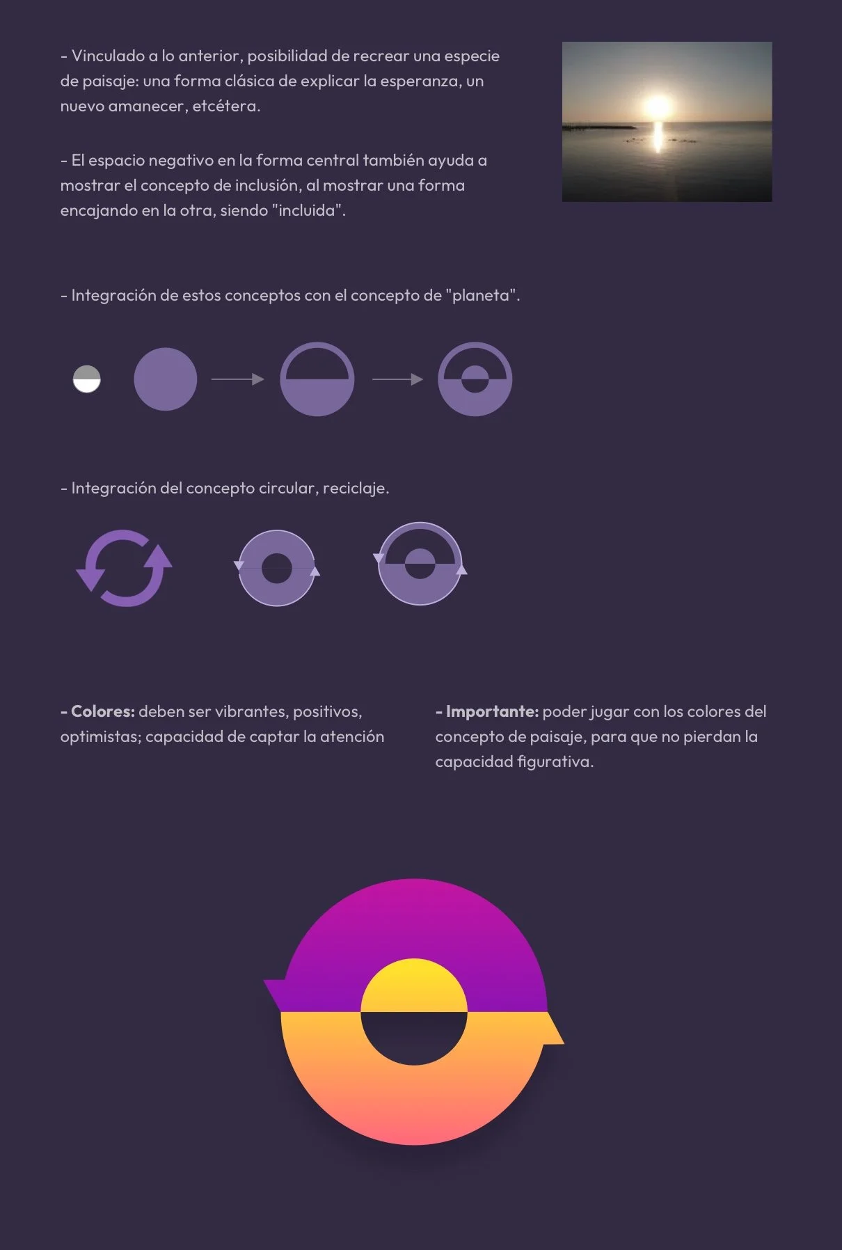
From this structure, the system evolves by incorporating a reading of an abstract landscape. The horizontal division of the circle generates a horizon, associated with the idea of a new sunrise and with the transition toward a fairer and more sustainable model.
The use of negative space reinforces the concept of inclusion: one form fitting into another, integrated as part of the system. The arrows strengthen this reading, connecting the different parts of the symbol and underlining the idea of a continuous and inclusive process.
In the same way, the concept of recycling is integrated into the design through the inclusion of arrows. The circularity of the whole, combined with these arrows, removes any sense of beginning or end, aligning the system with the logic of recycling and constant regeneration.
Color is incorporated as part of the landscape; tones associated with the sky and the sun reinforce an optimistic and positive approach, consistently maintaining the conceptual relationship between horizon, circularity, and process.
The result is a visual identity built as a dynamic circular system, where shapes, arrows, and color work together to communicate circular economy, social inclusion, and equality, directly reflecting the underlying logic of the Takatari model.