
Otros proyectos / Other projects

ARTISTYCOM
UX / UI & Visual Identity
Artistycom: overview of some elements
Diseño UX/UI de la plataforma digital Artistycom, un sistema de networking, colaboración y crowdfunding artístico que conecta artistas, profesionales del sector y fans, permitiendo la creación de perfiles, la compartición de obras, la búsqueda de colaboradores y la financiación de proyectos creativos.
La primera versión de la plataforma se lanzó con un alcance geográfico limitado a Nueva Caledonia y Tahití, incorporando una arquitectura de información multi-rol y flujos de crowdfunding con validación administrativa para reforzar la transparencia y la confianza entre los miembros.
—
UX/UI design of the Artistycom digital platform, an artistic networking, collaboration and crowdfunding system that connects artists, industry professionals and fans, enabling profile creation, content sharing, collaborator discovery and creative project funding.
The first version of the platform was launched with a limited geographic scope in New Caledonia and Tahiti, incorporating a multi-role information architecture and administratively validated crowdfunding flows to reinforce transparency and trust among members.
OKCARGO
UX / UI
Okcargo: overview of some screens (app and dashboard)
Okcargo: Example screens (dashboard and app)
Diseño desde cero de toda la plataforma digital y el dashboard de OkCargo, así como de la aplicación móvil y la identidad visual, para una plataforma digital orientada al transporte de mercancías de carga completa.
El proyecto se centró en crear un sistema claro y eficiente para la gestión operativa y la coordinación de flujos logísticos entre distintos actores dentro de un entorno de alta complejidad funcional.
—
UX/UI design from scratch of the entire digital platform and dashboard for OkCargo, as well as the mobile application and visual identity, for a digital platform focused on full-truckload freight transport.
The project focused on creating a clear and efficient system for operational management and the coordination of logistical flows between different stakeholders within a high-complexity environment.
CREADOOR
UX / UI & Visual Design
Creadoor: overview of some screens
Creadoor: Example screens
Diseño UX/UI de la plataforma digital Creadoor, orientada a conectar marcas con creadores de contenido para la gestión de colaboraciones, campañas y acuerdos entre ambas partes.
El proyecto se centró en estructurar un sistema claro de perfiles, propuestas y comunicación, facilitando el matching entre marcas y creadores dentro de un entorno digital sencillo y escalable.
—
UX/UI design of the Creadoor digital platform, focused on connecting brands with content creators for the management of collaborations, campaigns and agreements between both parties.
The project focused on structuring a clear system of profiles, proposals and communication, enabling efficient matching between brands and creators within a simple and scalable digital environment.
PAYCUI
UX / UI
Paycui: overview of some screens
Paycui: example screens
Diseño UX/UI de la aplicación Paycui para la gestión de pagos y procesos operativos en el sector de la restauración, desarrollada para dispositivos móviles y orientada a mejorar la experiencia tanto de clientes como de establecimientos.
El proyecto se centró en simplificar flujos críticos de pago y gestión diaria, priorizando rapidez, claridad de uso y reducción de fricción en contextos de alta rotación y uso intensivo.
—
UX/UI design of the Paycui application for payment management and operational processes in the restaurant sector, developed for mobile devices and focused on improving the experience for both customers and venues.
The project focused on simplifying critical payment and daily management flows, prioritizing speed, usability clarity and friction reduction in high-turnover, high-frequency usage contexts.
UTTOPION
UX / UI
Uttopion: overview of some screens
Uttopion: example screens
Diseño UX/UI de la plataforma digital UTTOPION, un entorno virtual orientado al metaverso que integra experiencias sociales, contenidos digitales y espacios interactivos accesibles desde navegador y aplicaciones.
El proyecto se centró en definir una experiencia coherente entre distintos entornos y dispositivos, estructurando la navegación, la interacción y la identidad visual dentro de un sistema complejo y en constante evolución.
—
UX/UI design of the UTTOPION digital platform, a metaverse-oriented virtual environment that integrates social experiences, digital content and interactive spaces accessible via browser and applications.
The project focused on defining a consistent experience across different environments and devices, structuring navigation, interaction and visual identity within a complex and continuously evolving system.
CENIT FINANCE
UX, UI, Visual Design & Visual Identity
Cenit Finance: Visual Identity
Cenit Finance: Dashboard screens (example)
Diseño UX/UI y de identidad visual para Cenit Finance, una plataforma digital orientada al entorno DeFi y a la gestión de activos financieros mediante un sistema de dashboard.
El proyecto se centró en estructurar información financiera compleja de forma clara y comprensible, priorizando jerarquía visual, legibilidad y confianza en un contexto de alta sensibilidad operativa.
—
UX/UI and visual identity design for Cenit Finance, a digital platform focused on the DeFi environment and the management of financial assets through a dashboard system.
The project focused on structuring complex financial information in a clear and understandable way, prioritizing visual hierarchy, readability and trust within a highly sensitive operational context.
ALFANAR ENERGÍA
UI
Alfanar Energía: overview of some screens
Alfanar Energía: Example screens
Diseño UX/UI y visual de la web corporativa de Alfanar Energía, orientada a comunicar los servicios, proyectos y valores de la compañía dentro del sector energético.
El proyecto se centró en estructurar la información de forma clara y jerárquica, reforzando la identidad visual y la credibilidad de marca en un entorno corporativo y técnico.
—
UX/UI and visual design of the Alfanar Energía corporate website, aimed at communicating the company’s services, projects and values within the energy sector.
The project focused on structuring information clearly and hierarchically, reinforcing visual identity and brand credibility in a corporate and technical environment.
ZÔDIO
UX, UI & Visual Design (e-commerce)
Zôdio: examples of process steps
Zôdio: design examples
Diseño UX/UI y visual del e-commerce de Zôdio, orientado a la venta online de productos de decoración, hogar y bricolaje dentro de un entorno digital de gran catálogo. Proyecto desarrollado en colaboración con Malt y posteriormente destacado como success story por la plataforma:
https://resources.malt.com/es/entreprises/success-story/zodio-malt/
El trabajo se centró en optimizar la navegación, la estructura de categorías y los flujos de compra, priorizando claridad, consistencia visual y facilidad de uso en un contexto de alta densidad de producto.
—
UX/UI and visual design of the Zôdio e-commerce platform, focused on the online sale of home decor, household and DIY products within a large-scale catalog environment. Project developed in collaboration with Malt and later featured as a success story by the platform:
https://resources.malt.com/es/entreprises/success-story/zodio-malt/
The work focused on optimizing navigation, category structure and purchase flows, prioritizing clarity, visual consistency and ease of use in a high product-density context.
GRACE
UX / UI & Visual Identity
Grace: Visual identity proposal
Grace: Website design
Diseño UX/UI y visual de la web de Grace, una marca orientada al sector de la nutrición y el bienestar, centrada en la comunicación de producto, valores y posicionamiento premium.
El proyecto se centró en crear una experiencia clara y cuidada, equilibrando contenido informativo y emocional, y reforzando la percepción de marca a través de una jerarquía visual limpia y coherente.
—
UX/UI and visual design of the Grace website, a brand focused on the nutrition and wellness sector, centered on product communication, brand values and premium positioning.
The project focused on creating a clear and refined experience, balancing informational and emotional content, and reinforcing brand perception through a clean and coherent visual hierarchy.
CHANGAS
UX / UI
Changas: overview of some screens
Changas: Example screens
Diseño UX/UI de la aplicación Changas, una plataforma móvil orientada a conectar personas que necesitan realizar tareas o pequeños trabajos con usuarios dispuestos a ofrecer esos servicios.
El proyecto se centró en simplificar la publicación de tareas, la búsqueda de servicios y la comunicación entre usuarios, priorizando rapidez de uso y claridad en un entorno de interacción frecuente.
—
UX/UI design of the Changas application, a mobile platform aimed at connecting people who need small tasks or jobs completed with users willing to provide those services.
The project focused on simplifying task posting, service discovery and communication between users, prioritizing speed of use and clarity in a high-frequency interaction environment.
PINCH
UX / UI
Pinch: overview of some screens
Pinch: Detail view
Diseño UX/UI de la aplicación Changas, una plataforma móvil orientada a conectar personas que necesitan realizar tareas o pequeños trabajos con usuarios dispuestos a ofrecer esos servicios.
El proyecto se centró en simplificar la publicación de tareas, la búsqueda de servicios y la comunicación entre usuarios, priorizando rapidez de uso y claridad en un entorno de interacción frecuente.
—
UX/UI design of the Changas application, a mobile platform aimed at connecting people who need small tasks or jobs completed with users willing to provide those services.
The project focused on simplifying task posting, service discovery and communication between users, prioritizing speed of use and clarity in a high-frequency interaction environment.
AKASHA
UX / UI
Akasha: overview of some screens
Akasha: Example screens
Diseño UX/UI de la plataforma Akasha, un sistema ERP orientado a la gestión integral de procesos empresariales mediante dashboards y herramientas de administración centralizadas.
El proyecto se centró en estructurar grandes volúmenes de información y funcionalidades dentro de una experiencia clara y eficiente, priorizando navegación, jerarquía de datos y facilidad de uso en entornos de gestión complejos.
—
UX/UI design of the Akasha platform, an ERP system aimed at the comprehensive management of business processes through centralized dashboards and administrative tools.
The project focused on structuring large volumes of information and functionalities into a clear and efficient experience, prioritizing navigation, data hierarchy and usability in complex management environments.
UBIME
UX / UI
Ubime: overview of some screens
Ubime: Example screens
Diseño UX/UI de la aplicación Ubime, una plataforma orientada a centralizar y facilitar el acceso a servicios y recursos municipales para ciudadanos dentro de un entorno móvil.
El proyecto se centró en organizar múltiples servicios públicos dentro de una experiencia clara y accesible, priorizando simplicidad de navegación y facilidad de uso para perfiles de usuario diversos.
—
UX/UI design of the Ubime application, a platform aimed at centralizing and facilitating access to municipal services and resources for citizens within a mobile environment.
The project focused on organizing multiple public services into a clear and accessible experience, prioritizing navigation simplicity and ease of use for diverse user profiles.
CARSONSALE
UX / UI

CarsonSale: overview of some screens

CarsonSale: Example screens
Diseño UX/UI de la aplicación CarsonSale, una plataforma móvil orientada a la compra y venta de vehículos entre usuarios dentro de un entorno digital sencillo y accesible.
El proyecto se centró en simplificar la publicación y búsqueda de vehículos, así como la comunicación entre compradores y vendedores, priorizando claridad de información y facilidad de uso durante el proceso de decisión y contacto.
—
UX/UI design of the CarsonSale application, a mobile platform focused on enabling users to buy and sell vehicles within a simple and accessible digital environment.
The project focused on simplifying vehicle listing and discovery, as well as communication between buyers and sellers, prioritizing information clarity and ease of use throughout the decision and contact process.
ALLTHINGS.ME (Obstgarten-App)

COLEGIO OFICIAL TRABAJO SOCIAL de LA RIOJA
Visual identity

The Official Social Work College from La Rioja (Spain) was looking for a new logo that fit its needs for a more contemporary and communicative brand.
The aim of the new logo is to achieve two objectives; on the one hand, it seeks to modernize the image of the school, bringing it closer to present times, and on the other hand it’s intention is to explicitly and clearly represent the values of social work.
To do this, I started from scratch at the conceptual level and all basic elements in the logo were rethought: form, colors and shadows.
Fundamentally the isotype is composed of two identical figures; the idea behind that is to humanize the concept and make an approximation of the positions related to social work and of the citizens who use it possible.
The figure closest to the viewer represents the Social Work, its workers. In addition, it includes the colors of the flag of La Rioja. In front of this figure we have what could be the shadow of the first, but by deliberately moving it away from one another it appears as a new figure by itself; it represents the people that social work helps. The figures have a position of approach, of embracing each other, and it is this action that determines the meaning of the logo: moving away from other concepts such as charity or beneficence, the attitudes of the figures transmit more the delivery of help in a friendly manner, like equals. In this way, it helps to configure the idea to perceive the College as a friend more than a "cold" institution.
Related to stylistic aspects, the color base of black and grey was selected for purposes of saving and ease of use in black and white, losing in this last case only the representative colors of the flag of La Rioja (which are in color).
MARSJOBS
Visual identity

Marsjobs, a startup based in Berlin with a vision to impact the jobs ecosystem, needed a logo and corporate branding to visually represent them as high quality and professional.
The first step was to really understand the company's vision. Once done, the first challenge was clear: how to visually relate Mars and Jobs within one element. The result needed to be attractive, simple and memorable. After careful deliberation, the solution was to integrate a representation of Mars and Earth in a single message, referring to the people, the aspirants to the works:
Mars = Companies, Earth = People
The reason was to be able to put on the same plane concepts such as Mars, jobs and people, which are not linked. I needed to convert the concepts to the same "language" that, in this case, would be celestial bodies. In this way, the logo message could be coherent and transversal, becoming an "everything".
The company itself already includes Mars, and the reason for choosing Earth to represent the people is quite obvious. An interesting parallelism is also made with the understanding that the search for work is usually associated with feelings of emotion, adventure and novelty, which are similar to what the concept of Mars has traditionally evoked in the human being.
The intersection of both concepts represents both sides of the equation: people that look for jobs and companies that are offering them. Thus giving rightful meaning to the concept of Marsjobs.
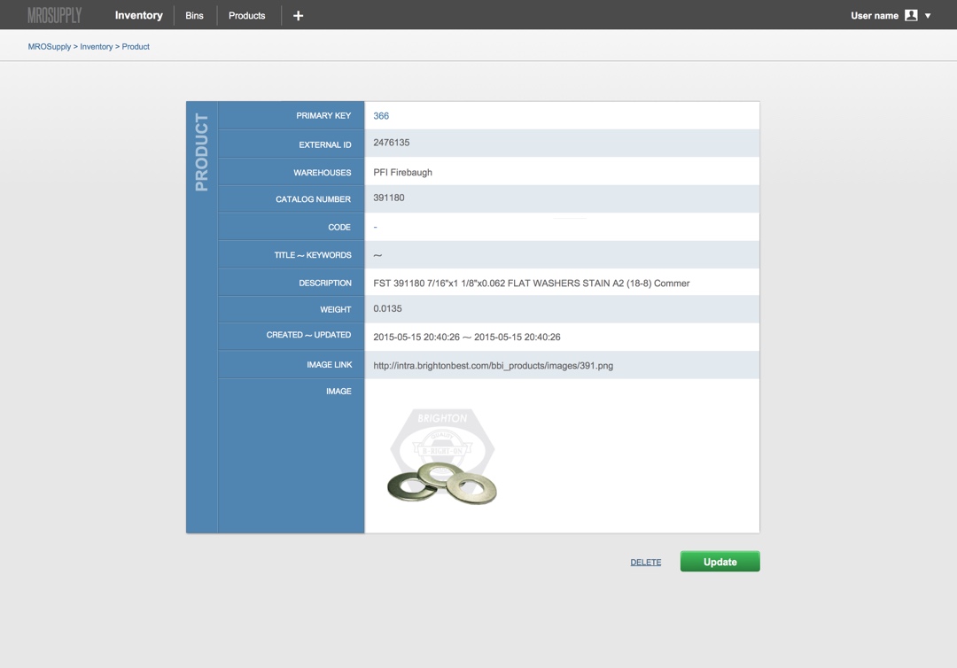
MRO SUPPLY
UX / UI
MROsupply.com is the e-commerce extension of Mechanical Drives and Belting, established in 1898 in Los Angeles (yes, 1898, not 1998). They have over 700k parts available and clients like Coca-Cola, Whole Foods and Space X.
My work, as a Proudsugar member, was the redesign of (among other elements): the shopping cart, the product page, the checkout and the registration process. The effort focused on the improvement of the UX, the generation of trust and the ease of purchase from the user, more than any changes in the the visual design.
Next are the old and new versions comparison:
Old version: Shopping cart

New version: Shopping cart

Old version: Product page

New version: Product page

Old version: Checkout

New version: Checkout
Also created from scratch was was the design of a new platform for MRO Supply, an inventory management system.


PRAXIS
Visual identity


Praxis is a multidisciplinary social cabinet, from the perspective of social work and clinical psychology, and has extensive experience in the management of social resources, people and institutions.
They needed a visual identity, including among other elements, the logo, the stationery, signs or brochures.
PELICAN BAZAAR
UX / UI

Pelican Bazaar, a brazilian e-commerce focused on premium products. The goal was to create a perfect blend between visual communication, product marketing and technology. The outcome: a page that presents a solid and coherent brand that communicates trust and quality.
DR. DOBIAS
UX / UI

Old version (checkout)

New version (checkout): work on UX & visual design
Peter Dobias is a holistic veterinarian with more than 20 years experience. His online business focuses on providing content around prevention and diagnosis for animal diseases, especially dogs.
The goal was to increase conversions along the sales funnel. Especially click-through rates from the shopping cart to the checkout page.
The work done, as part of Proudsugar, with UX and visual design increased conversions from the shopping cart to the checkout page by 30%.
WISSING RECHTSANWÄLTE
UX / UI
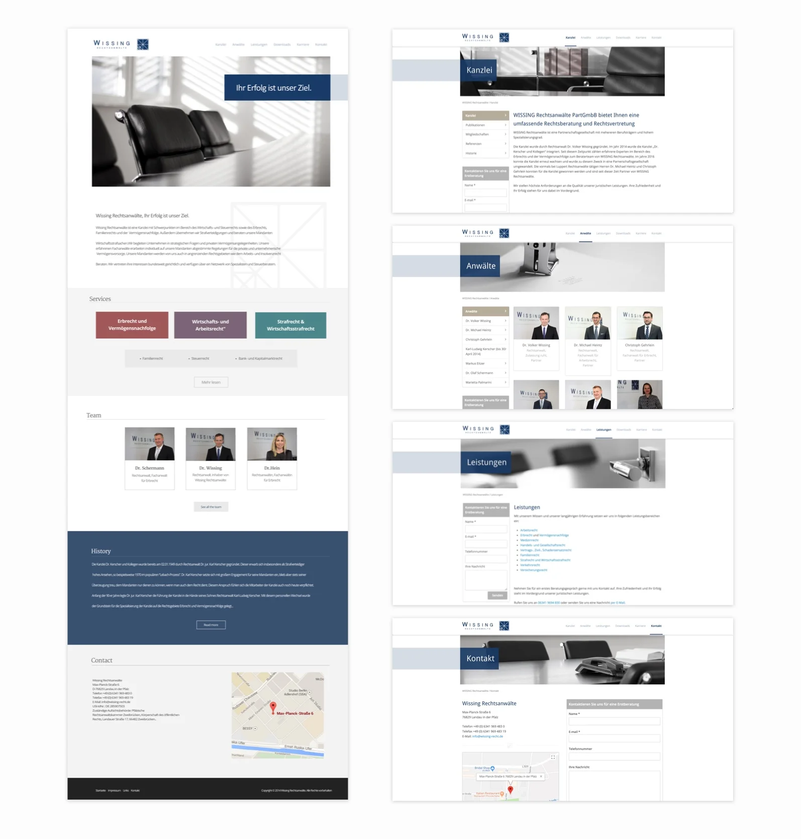
Wissing Rechtsanwälte helps medium-sized companies in all strategic legal matters.
They needed a website that fit its requirements of formality, trustworthiness, clarity and quality, as a precept to communicate to its users.
